
Benjamin Moore Colour Trends 2026: The Shades Shaping Design
Every year, Benjamin Moore releases a Colour Trends palette that captures where design is heading — not in a trendy way, but in a way that reflects mood, texture, and the way people want their homes to feel.
This year, the 2026 palette leans toward something we welcome on the West Coast: softer, layered, inviting spaces that pair well with natural materials and gentle light.
For us at Meme Brooks Design, two colours stood out immediately: Southwest Pottery 048 and Silhouette AF-655. Each one brings something distinct to a space, and both align closely with our design philosophy.
These colours create a mood that feels modern and lived-in — a combination that works perfectly with our signature styles: West Coast Modern, refined minimalism, and Japandi.
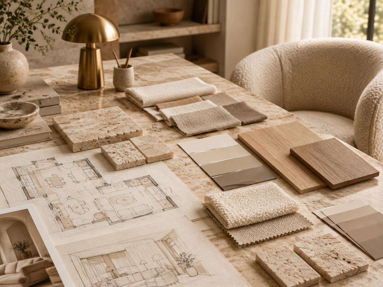
We used both shades to shape a fresh interpretation for our studio. These tones photograph beautifully, but more importantly, they feel even better in person.


Southwest Pottery — Warm, Earthy, Sun-Baked Depth
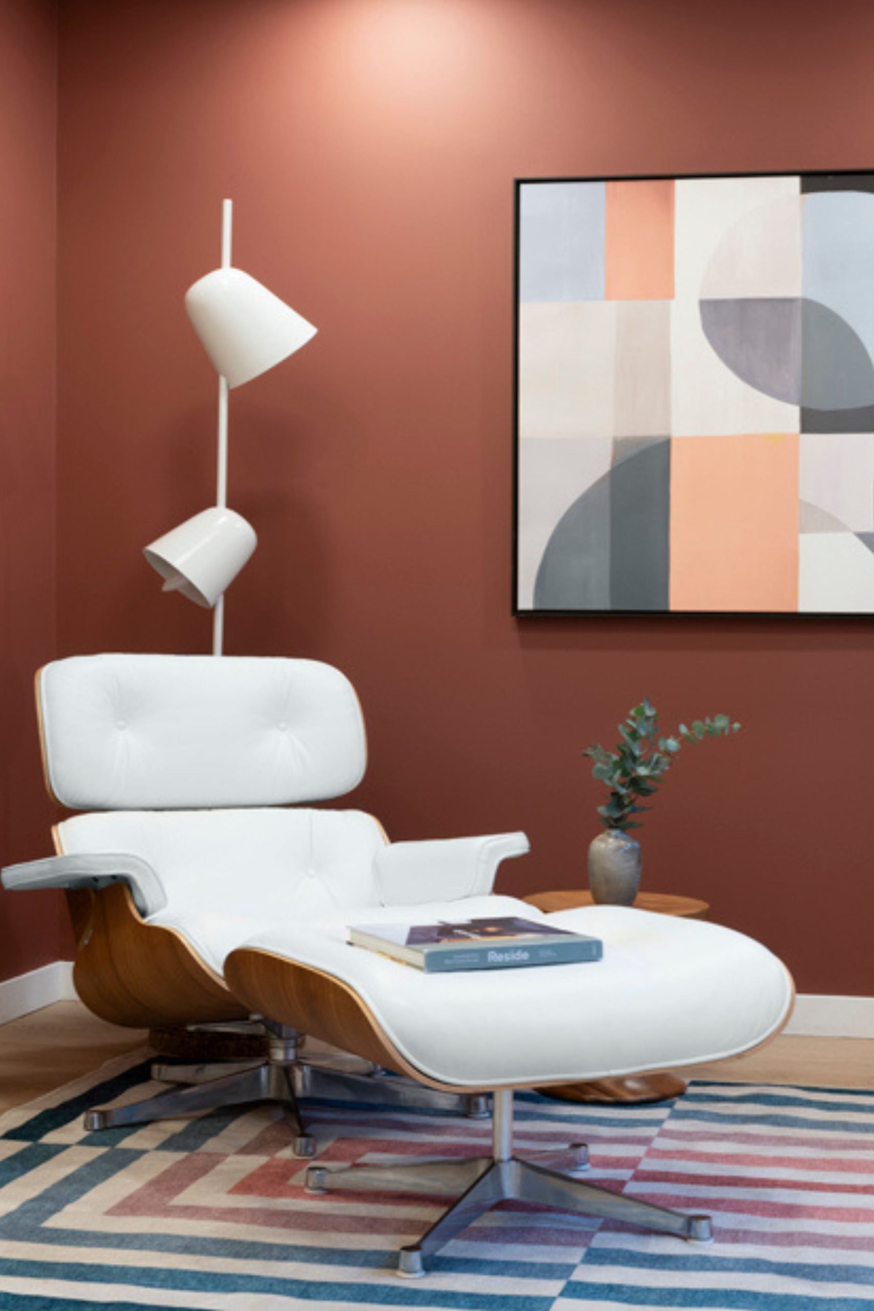
Benjamin Moore describes Southwest Pottery as a warm, clay-inspired red-brown — evocative of kiln-fired ceramics and desert pottery. It’s earthy, grounding, and full of character.
Where it works beautifully:
- Living rooms, dens, or bedrooms needing warmth and richness
- Accent walls that add depth without heaviness
- Spaces with natural woods, linen, plaster, or stone
- Heritage or West Coast Modern homes that embrace organic materials
Its appeal is its honesty — a shade that feels tactile and lived-in. For our studio, it brings a sense of warmth that complements our love of natural textures.
Silhouette — Moody, Sophisticated, Architectural
Silhouette is a deep espresso with charcoal undertones — refined, modern, and quietly dramatic. It’s the kind of shade that adds structure and presence without shouting.
Where it excels:
- Fireplace areas or feature nooks needing depth
- Millwork, doors, trims, or built-ins that benefit from a dark, grounded neutral
- Dining rooms or intimate bedrooms with ambient lighting
- Contemporary spaces that need a moment of contrast
It’s a colour that anchors a space — ideal for architectural details, cabinetry, or areas where you want a sense of weight and sophistication.


Why These Colours Resonated With Us
As a West Coast–based studio, we’re always paying attention to how colour interacts with light, texture, and natural materials. Both of these shades — though extremely different — behave beautifully with the elements we value:
- woods
- stone
- matte metals
- plaster
- linen textures
Southwest Pottery adds warmth and soul. Silhouette adds depth and intention.
They each bring something timeless to a space without feeling trendy or over-designed.
A Healthier Direction for Homes
During our interview with the Benjamin Moore team at IDS Vancouver, one message stood out: colour is evolving alongside wellness.
Both shades are available in eco-friendly low VOC formulations — a must for clients who care about indoor air quality as much as aesthetics. Beauty and wellness can coexist, and this palette reinforces that.
A Thoughtful Direction for 2026
The 2026 Colour Trends palette isn’t about bold statements or rigid rules. It’s about creating rooms that feel layered, personal, and quietly confident. For us, choosing Southwest Pottery and Silhouette wasn’t about blindly following a trend — it was about selecting colours that stand the test of time, work with natural materials, and enrich the architecture rather than distract from it.
Design evolves, but intention never goes out of style — and these colours reflect that beautifully.