MONTSERRAT
BOLD
ABCDEFGHIJKLMNOPQRSTUVWXYZ
abcdefghijklmnopqrstuvwxyz
0123456789
Uppercase preferred. Headlines, section titles, navigation and key messaging.
Reference tracking: +200 Back to website
A refined identity for the way we design, build and live.
The supplied MEME logo is the primary identity for the website and brand communications.
Preserve the supplied lettering and its proportions. Maintain generous clear space; never stretch, crowd or place the logo on visually busy imagery.
Primary logoStacked MEME letterforms, with a staggered sequence of highlights cycling through the grid.
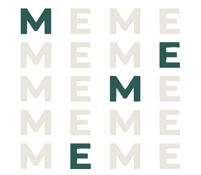
The four-letter grid repeats vertically. Deep-teal highlights travel through the muted letterforms, keeping the structure fixed while the emphasis changes.
Still presentation for reduced-motion preferences. Brand applications use the same stacked-letter language.
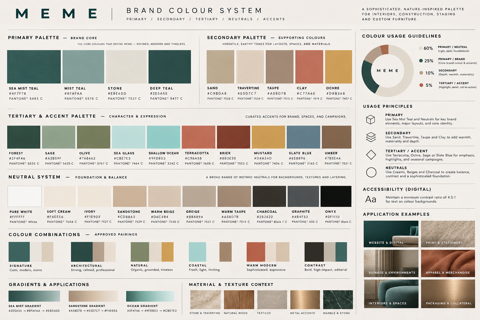
Primary / Secondary / Tertiary / Neutrals / Accents — transcribed from the supplied colour guidelines.
Sea Mist Teal and neutrals anchor the identity. Sand, Travertine, Taupe and Clay add warmth. Terracotta, Ochre, Sage and Slate Blue bring selective emphasis.
Maintain a minimum contrast ratio of 4.5:1 for body text. Light and mid-tone swatches are not interchangeable text colours; use a tested dark neutral or deep teal.
Calm, modern, iconic
Strong, refined, professional
Organic, grounded, timeless
Fresh, light, inviting
Sophisticated, expressive
Bold, high-impact, editorial
Deep teal → Mist teal → Stone
Taupe → Travertine → Soft cream
Forest → Shallow ocean → Sea glass
Montserrat for clarity and structure. Playfair Display for a considered editorial accent.
ABCDEFGHIJKLMNOPQRSTUVWXYZ
abcdefghijklmnopqrstuvwxyz
0123456789
Uppercase preferred. Headlines, section titles, navigation and key messaging.
Reference tracking: +200ABCDEFGHIJKLMNOPQRSTUVWXYZ
abcdefghijklmnopqrstuvwxyz
0123456789
Sentence case or lowercase. Body copy, captions, labels and longer-form content.
Reference tracking: +25 to +50ABCDEFGHIJKLMNOPQRSTUVWXYZ
abcdefghijklmnopqrstuvwxyz
0123456789
Title or sentence case. Editorial headlines, feature quotes and refined accents.
Reference tracking: +10 to +20PROJECT OVERVIEW
Montserrat Regular · 24–28pt · +50Thoughtful spaces for modern living.
Crafted with precision, designed for
a more beautiful tomorrow.
CUSTOM FURNITURE
Montserrat Regular · 12pt · +75Sizes and tracking above reproduce the supplied document specifications; digital specimens adapt in size for smaller screens.
How MEME sounds: a West Coast design-and-hospitality house that is warm, refined and quietly confident.
“Let’s make room for what matters.”
“Every detail, considered.”
“We design, build and style—start to finish.”
“Designed for living. Made for gathering.”
Write in short, clear sentences. Speak to people (“you”, “your home”) and about the moments a space makes possible, not only its finishes.
Four commitments drawn from the brand mission that guide every project, message and experience.
Every decision begins with how people will live, gather and feel in a space.
Considered materials, precise detailing and builds made to last.
A warm, attentive process that makes clients feel at home from the first meeting.
Spaces and moments people remember long after the work is complete.
Single-weight line icons on a 32px grid, 1.5px stroke with square ends, echoing the geometry of the MEME letterforms.
Use icons in Deep Teal or Charcoal on light neutrals, or white on Deep Teal. Keep icons at 24px or larger and never fill, outline-box or recolour them with accent tones.
The supplied M silhouette, with colour options drawn from the brand palette.
The white M on Mist Teal is installed as the website favicon. The single M is a compact signature, not a replacement for the primary logo.
The supplied application studies show the identity across print, apparel and physical environments.
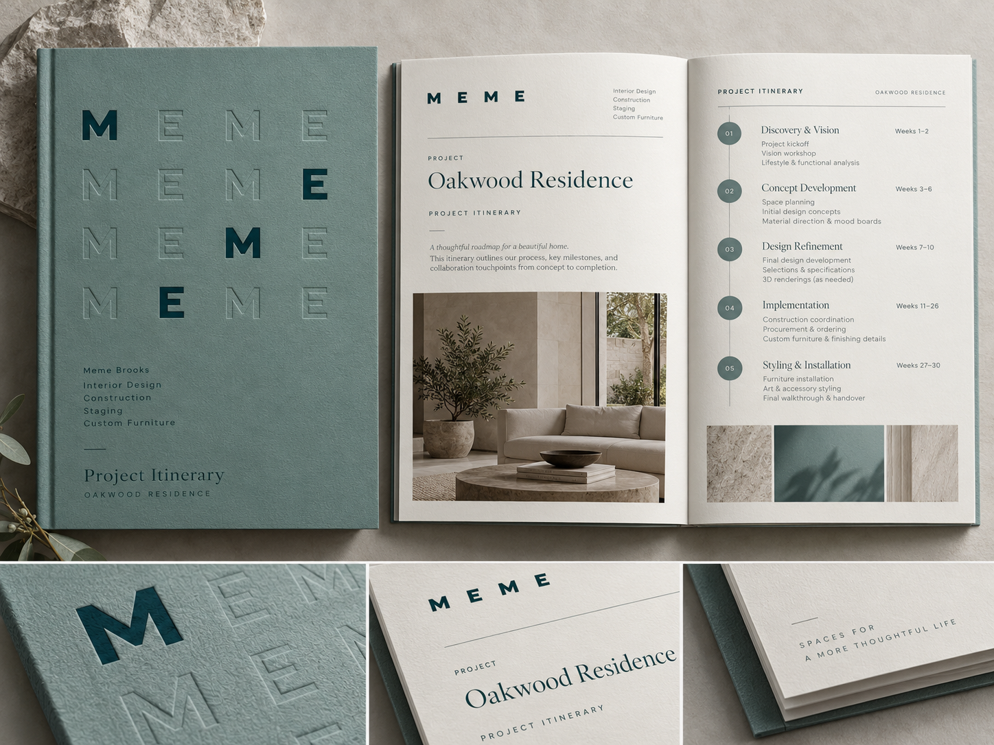
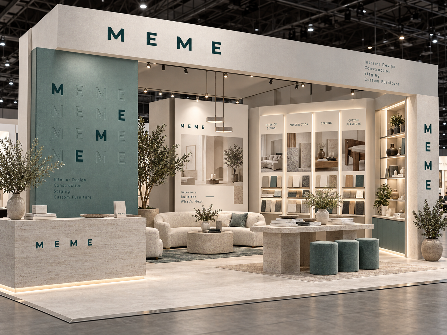
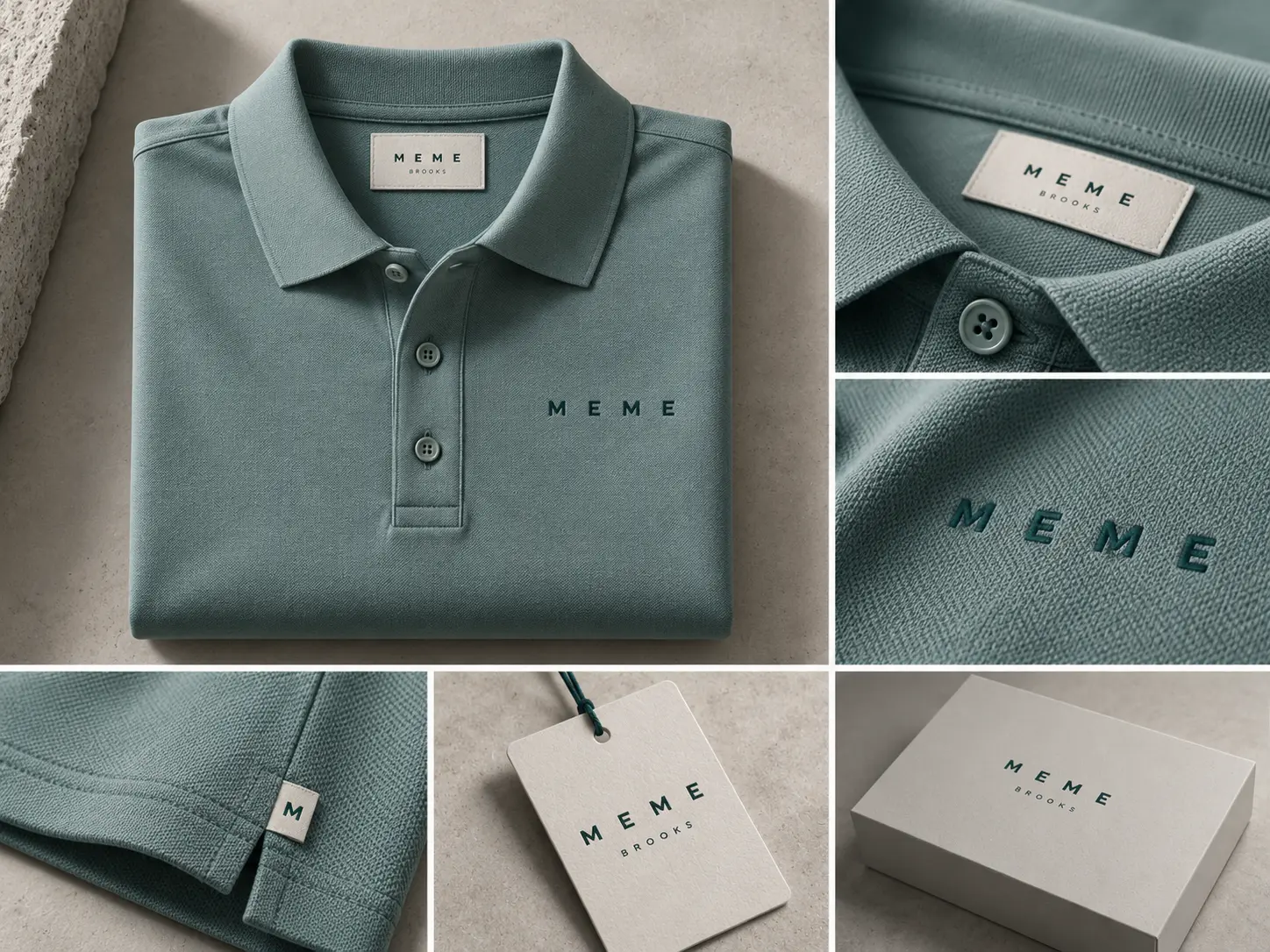
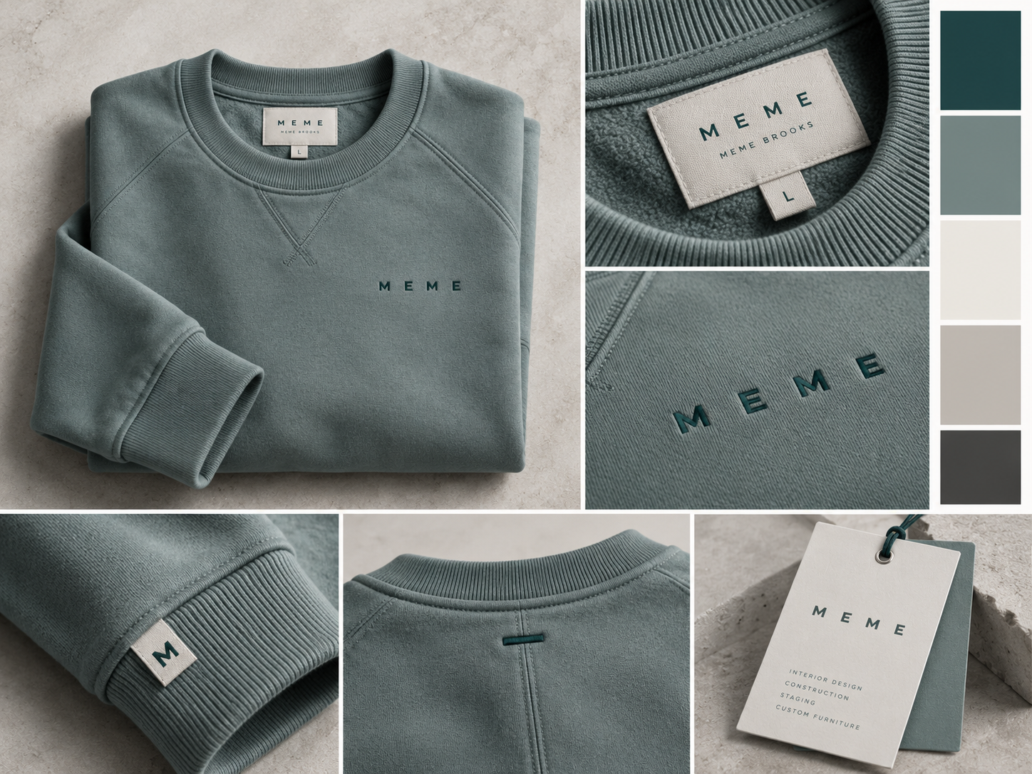
Client-supplied brand mockups. Project names, timelines and spaces shown are illustrative, not portfolio or service commitments.